In today's digital landscape, a visually appealing website is essential, but it’s only half the battle. If visitors can’t quickly find the information they need, they’ll likely abandon your site in favor of a more user-friendly alternative. Understanding how users naturally scan web pages is crucial for creating an engaging and effective online presence. Two primary scanning patterns have been identified through eye-tracking studies: the F-pattern and the Z-pattern. By leveraging these patterns, you can significantly enhance user experience and drive engagement.
The F-Pattern: Understanding Text-Heavy Pages
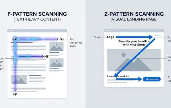
Eye-tracking studies have revealed a fascinating insight into how users approach text-heavy web pages. When confronted with a substantial amount of text, users’ eyes follow an F-shaped pattern. They begin by reading across the top of the page, forming the first horizontal line of the F. Then, their eyes drop down the left side, scanning for points of interest. When something catches their attention, they read horizontally again, but usually not as far across as the first time. This creates the second bar of the F.
This pattern is prevalent in various types of content, including blog posts, news articles, search results, and product listings. The reason it matters is that most of your content remains unseen. Users focus primarily on the top and left side of the page, giving everything else only a cursory glance at best.
Where the F-Pattern Excels
Text-heavy pages are the natural habitat of the F-pattern. Think blog posts, long-form articles, case studies, and even e-commerce product listings. Amazon's layout is a prime example, with product names on the left and prices or features on the right. A good web design agency understands this behavior and structures content accordingly, placing key information in the top and left areas where users' eyes naturally land.
The Z-Pattern: Guiding Users Through Visual Journeys
The Z-pattern operates differently, catering to pages with less text and a clearer visual hierarchy. Landing pages, homepages, sign-up forms, and ads are ideal candidates for this pattern. Users start at the top left, scan across to the top right, then diagonally down to the bottom left, and across again to the bottom right. This creates a visual journey that guides users through key elements like the logo, navigation, main message, and call to action.
When to Opt for the Z-Pattern
The Z-pattern is perfect for pages designed to drive action rather than extensive reading. Landing pages, with their headlines, images, brief copy, and prominent call-to-action buttons, benefit greatly from this layout. Homepages for services, SaaS products, and portfolios often follow the Z-pattern as well, focusing on showcasing what you do and guiding users to the next step.
Email campaigns also frequently employ the Z-pattern, leveraging limited space to deliver a clear message and a single goal. The pattern keeps the design simple and focused, ensuring users know exactly what to do next.
Key Differences and Design Tips
The primary distinction between the F-pattern and the Z-pattern lies in content density. The F-pattern excels with lots of text, allowing users to hunt for specific information. In contrast, the Z-pattern thrives with minimal copy and strong visuals, guiding users along a predetermined path.
For F-pattern pages, front-load your information, placing the most important content at the beginning of headlines and paragraphs. Use subheadings, bullet points, and short paragraphs to create scannable stopping points on the left edge. Keep the left margin clean and consistent, and break up text with white space to avoid overwhelming users.
For Z-pattern pages, establish clear visual anchors at each point of the Z. Ensure your logo, navigation, headline, image, and call to action align with this flow. Use contrasting colors or sizing to draw attention where it matters most. The Z-pattern works best when each element clearly leads to the next.
Common Pitfalls to Avoid
Avoid burying crucial information in the middle-right of text-heavy pages, as this area receives minimal attention in F-pattern scanning. On Z-pattern pages, resist the urge to add too much clutter. Extra text, multiple calls to action, or overly complex visuals can disrupt the flow. Stick to one pattern per page based on its purpose, and don't forget to test your designs on mobile devices, as these patterns adapt to smaller screens.
Applying These Insights to Your Website
Take a close look at your current pages. Text-heavy pages like blogs, resources, and documentation should follow F-pattern principles, while pages aimed at driving quick conversions, such as homepages, landing pages, and product pages, should adhere to the Z-pattern.
Working with a web design agency can streamline this process. They'll structure each page type appropriately and test it with real users to ensure it aligns with natural user behavior. The goal isn't to force a specific reading pattern but to design in harmony with how users naturally interact with your site.
The Bottom Line
Users scan websites; they don't read every word. The F-pattern and Z-pattern describe how this scanning behavior unfolds. F-patterns are ideal for content-rich pages where users seek information, while Z-patterns work best for simpler pages focused on action. Design with these patterns in mind, and your website will become more user-friendly. Users will find what they need faster, take action more often, and leave with a positive impression of your brand. Understanding user behavior isn't about manipulation; it's about respecting how people think and making their online experience seamless. That's the essence of good design.